SafeFest →
Helping create safety at music festivals
Client
C3 Presents
Services
Branding & identity / animation
Industry
Arts & culture
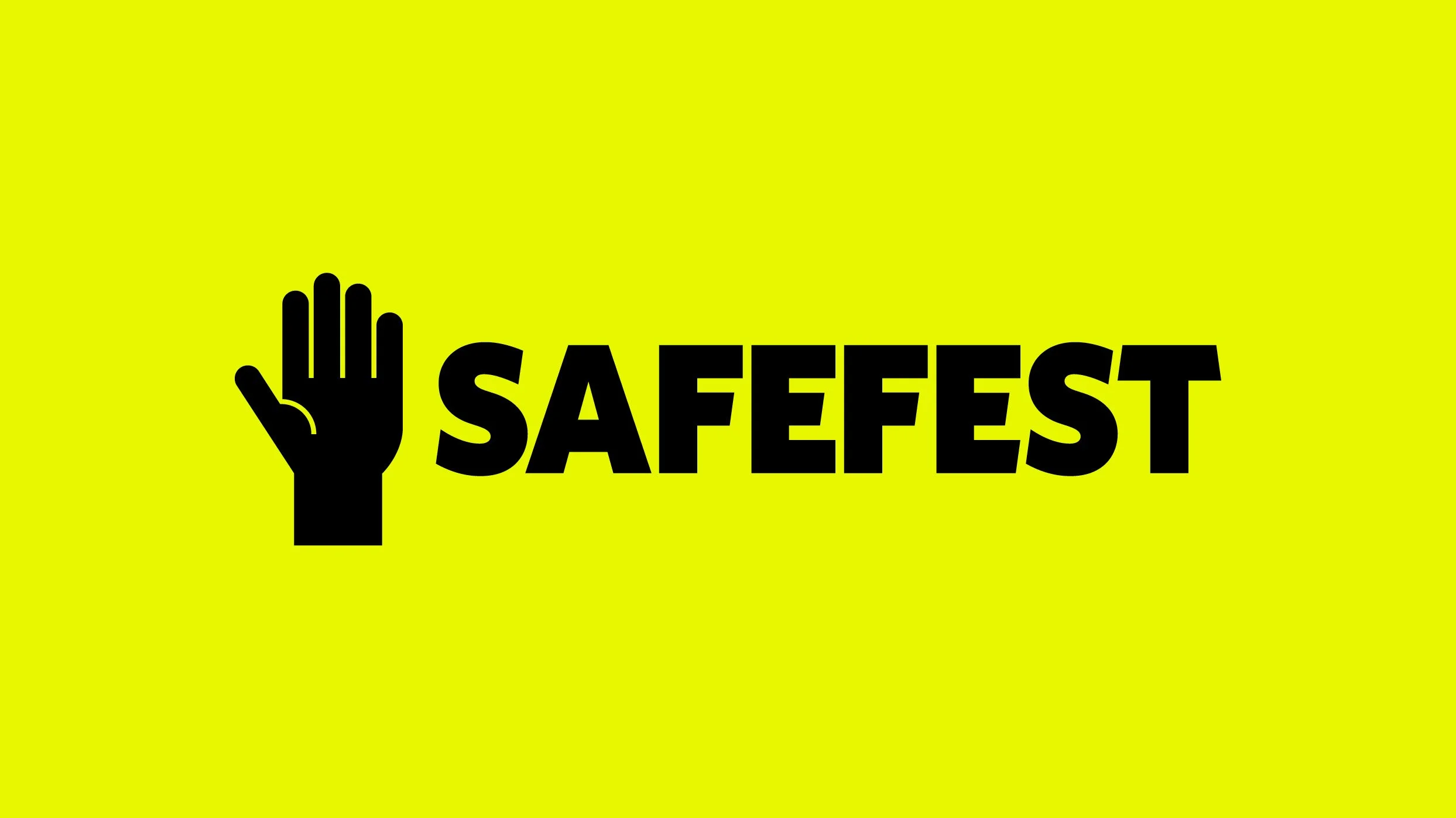
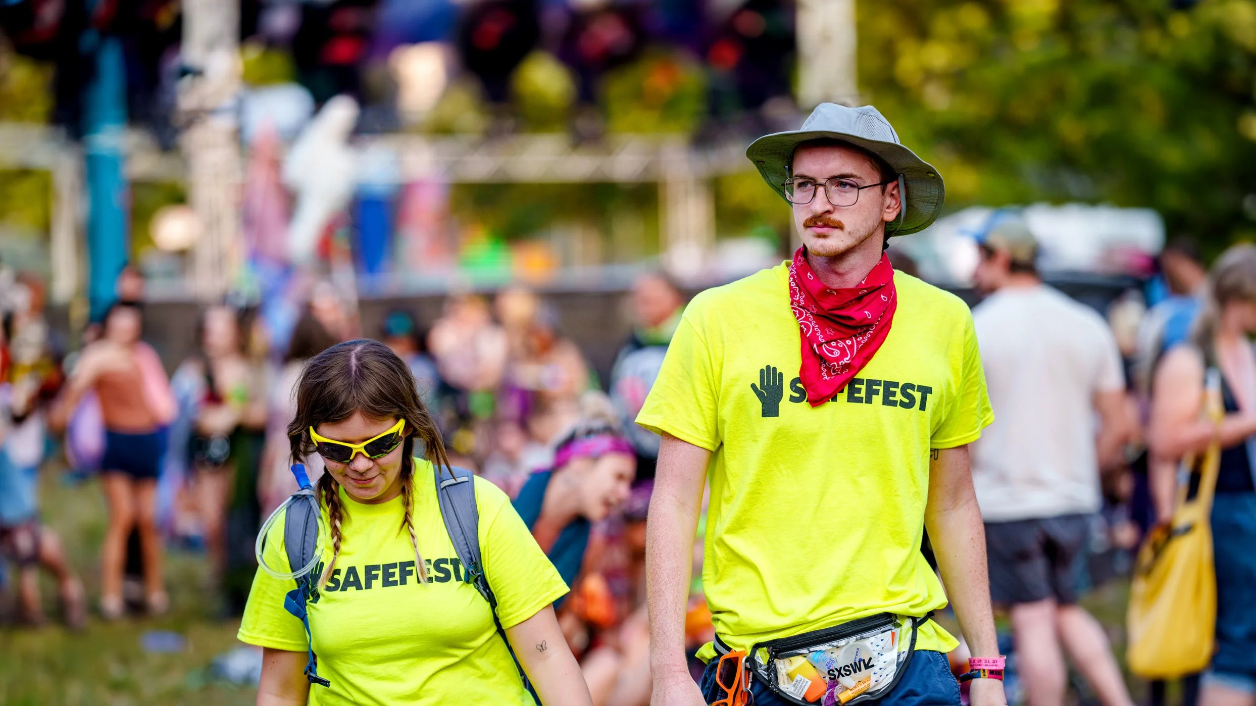
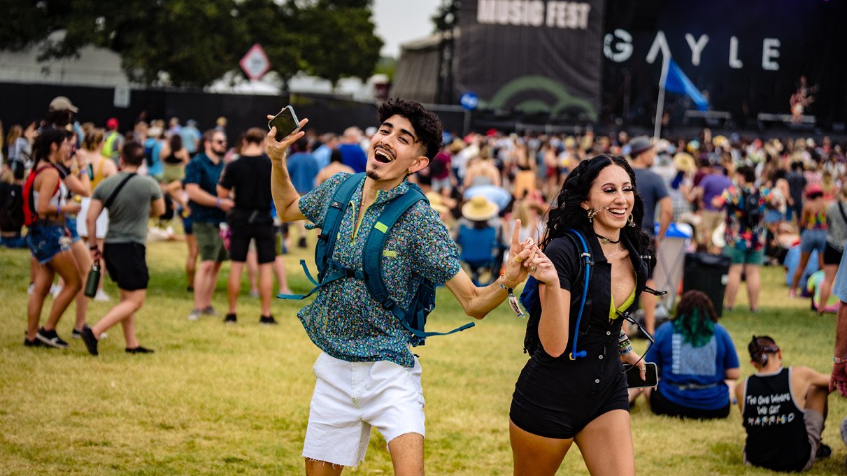
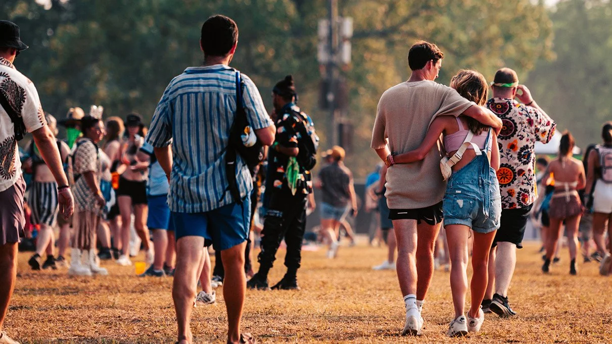
Say hey to SafeFest—SafeFest is a brand new team dedicated to creating a safe space for festival patrons by providing an additional resource that isn't medical or security.
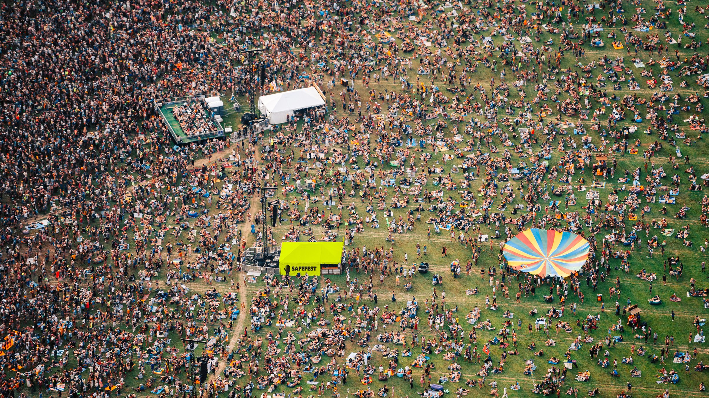
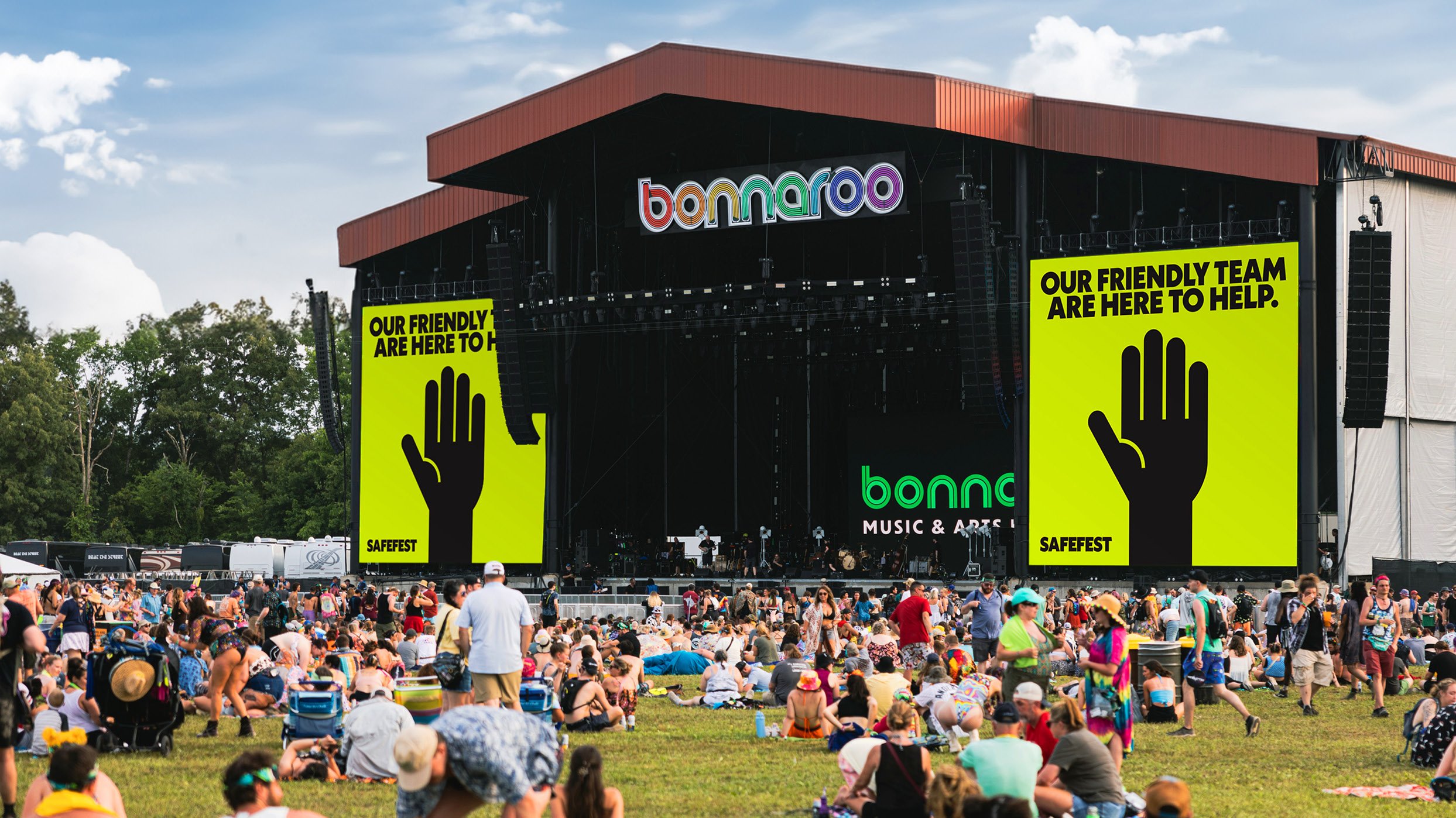
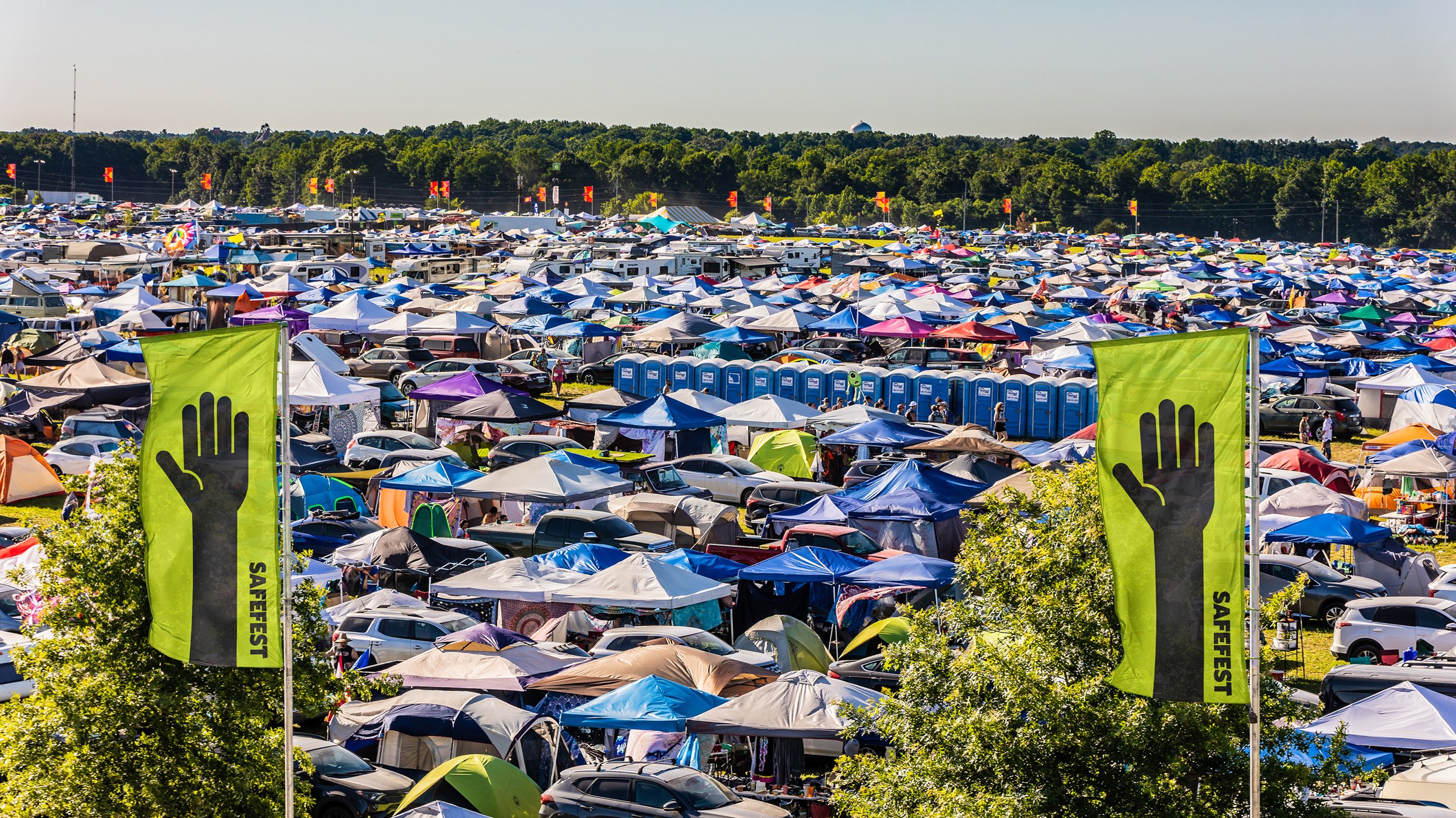
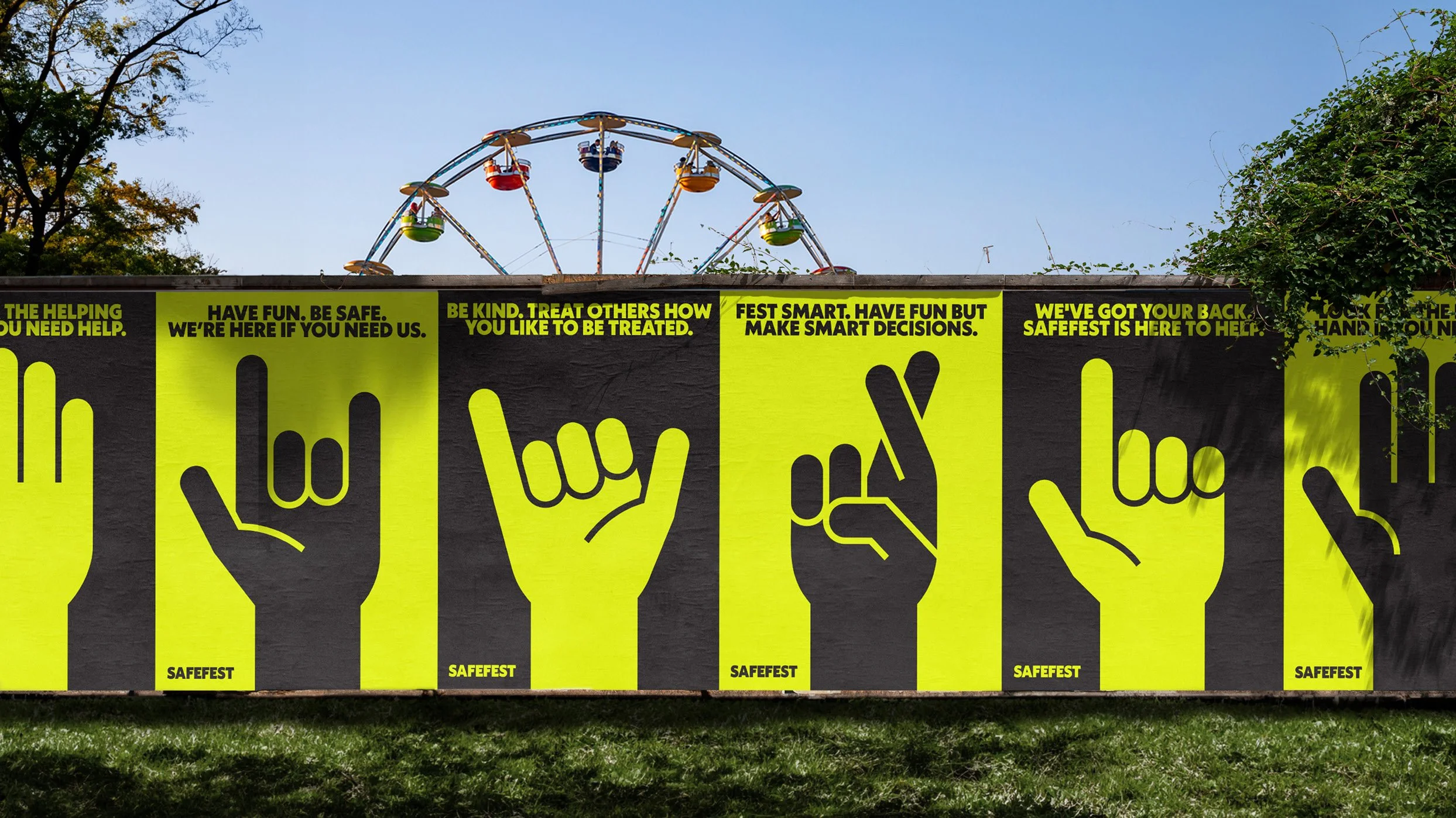
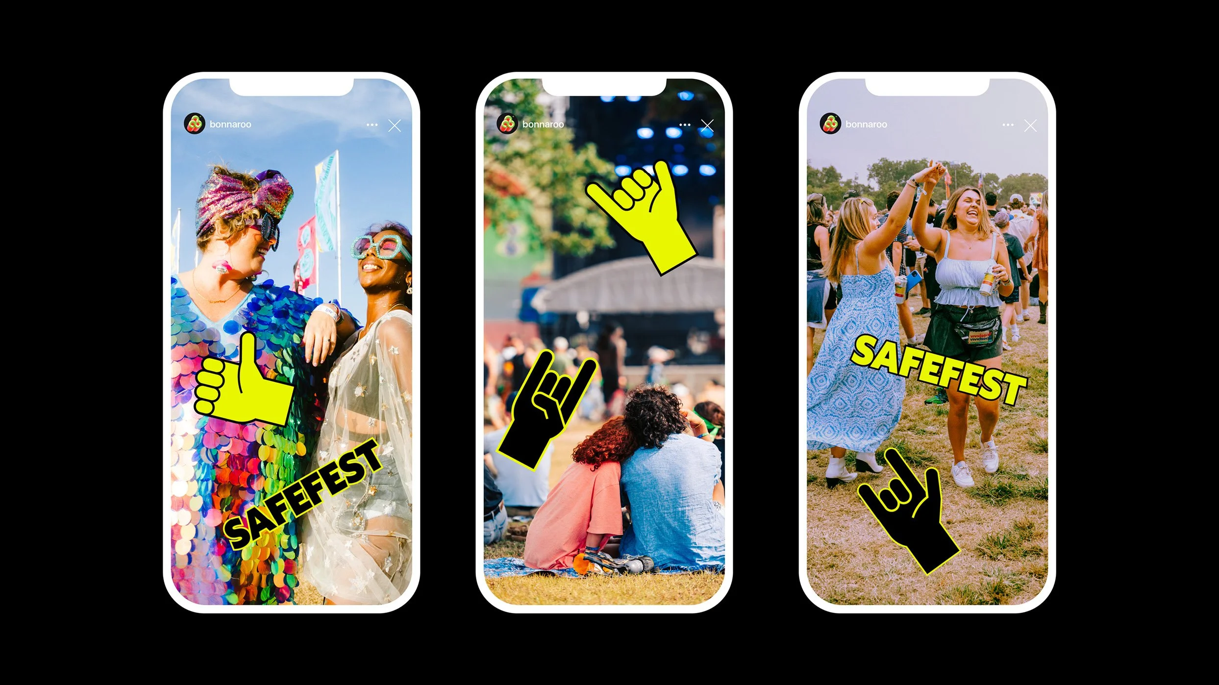
Puncture Design was tasked with creating the visual identity for SafeFest with the goal of standing out in a crowded and visually loud festival environment.
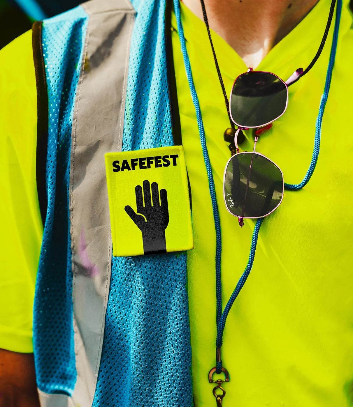
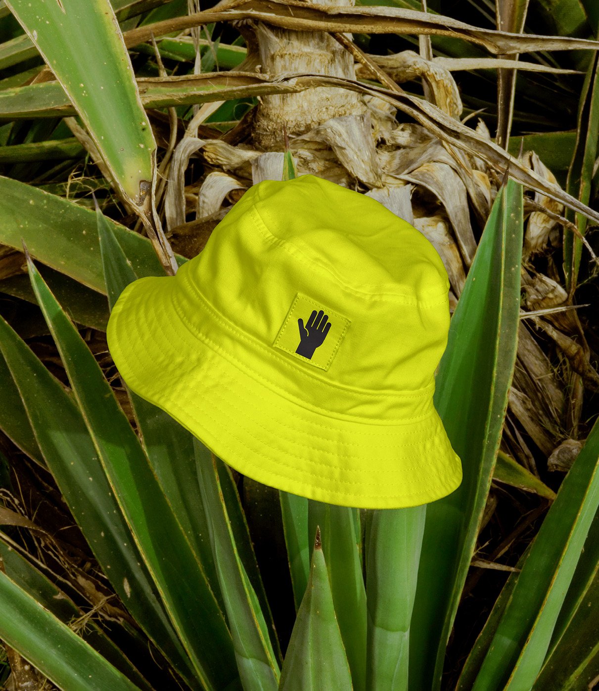
Puncture developed the SafeFest hand raised in the air—a universal symbol representing a need for help, wanting attention, or having a question. It's a gesture that is intuitive and can be understood quickly.
The hand is paired with a bright neon safety yellow, it's meant to draw attention from a distance, in the dark, or under impairment. It's a non-authoritative colour that will encourage festival goers to ask for help and watch out for each other.
Project Role
I was the designer on this project working with the Creative Director to create the brand. We initially helped define the vision of the identity and how it would fit with other brands at C3 Presents musical festivals. I designed and art directed the implementation of the brand which involved directing an animator for the motion work.